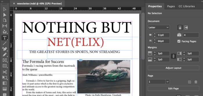
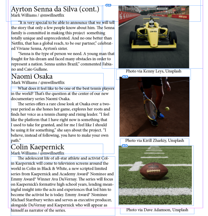
I really enjoyed the challenge of putting together a newsletter. Working with an existing Fortune 500 company and reusing the writing of existing articles allowed me to really focus on the theme and design side. This was a unique challenge for me, as I normally much prefer the writing side of things.
When I thought about writing for a Netflix audience, I thought about my own experience as a Netflix user. Although you could broadly say that Netflix subscribers are movie and TV lovers, that audience group can be extremely diverse. When I browse my Netflix page, there are endless categories of content. Some of it wouldn’t interest me at all.
As I compiled articles and pictures for my newsletter, I knew I wanted to focus on a specific theme. Sports felt like the perfect solution. It gave me a clear reader to target – someone who loves sports stories and competitions. I think this is a great audience for Netflix to try to win over. After all, many sports fans might assume that they need to rely on live broadcasts to get their fix of games and excitement.
I wouldn’t say my newsletter is perfect, but I’m so proud of how it turned out for a first attempt. I worked hard to incorporate a diverse but complementary selection of stories, as well as balance out the blocks of text with images. It was helpful to create my template beforehand, but I also found myself trying out new things once I was actually working in InDesign.
As you approach writing a newsletter, it’s important to create a final document that is engaging to look at and guides the reader down the page. This means creating a consistent color palette and not overwhelming the senses. Enjoy some screenshots from my first newsletter below!


